search
< Back to blog
Inspiration

5 Social Media Photo Tips for Busy Small Business Owners

As a small business owner, social media either scares you or doesn’t scare you enough. Wait, what? Yes, it is easy to take a photo and share it online. This is also what fuels the humor on Tumblr, which is full of poorly-taken real estate listing photos. Your photos should do more than fill space, though. They should sell your business.

What’s a small business owner to do? Sometimes you get so busy that you don’t post any photos, or other times you post bad photos. There’s a fix to this and it’s to post great photos online. How do you do it? Let’s clear it up with social media photo tips created just for you: small business owners.

A smartphone screen displaying social media apps


Photo Tip 1 – The Golden Hour is Your Best Friend

Take advantage of the Golden Hour – the hour before sunset – or the first hour of light if you’re an early bird. During those times, the lighting is perfect for your outdoor photography because of the diffusion of light. Think of direct light as a harsh light and golden hour light as a soft light. This lighting is great for selfies, real estate listings, and even models wearing your clothing and accessories.

Feeding your social media accounts with photos like these (along with an amazing caption) will attract visitors. People are drawn to light, so these types of photos appeal to us. Appealing photos on social media get likes, comments, and shares. That’s exactly what your small business needs.

“The reason the light is so much better at the very beginning and end of the day is because during the golden hour, the sun is really low in the sky, forcing the sunlight to pass through more of the Earth’s atmosphere on its way to the surface, greatly lowering the intensity of the direct light.” James Thomas Long Photography


Photo Tip 2 – Take Photos For Each Social Media Platform

Take advantage of the audiences you have on each social media platform by using similar, but different shots. What do we mean? Slightly different images give you the appearance of being everywhere without taking up too much of your time. You can use the same caption and post on different days on the other platforms.

Take one image landscape for Twitter and from a slightly different angle, take another shot using the same orientation for Facebook. Then for Instagram, take a square behind-the-scenes photo. Are you a florist? We’d love to see your finished product, but a photo of the before helps too. You can use the same caption for all three social media profiles, or slightly alter them to match.

Best Image Size for Twitter

According to Hootsuite’s 2023 cheat sheet, 1600 x 900 (2:1 for desktop and mobile) is the best image size for an image showing on the Twitter feed. As users are scrolling, they’ll see automatically cropped images if your post doesn’t match. Unfortunately, cropping can affect your brand’s perception online, so easily size your images specifically for Twitter in Photo Studio first. You’ll thank us later.

Best Image Size for Facebook

Hootsuite’s 2023 cheat sheet also indicates that the best size for Facebook images for their feed on desktop and mobile is 1200 x 630. This is the best size for your blog’s featured images as well since Facebook’s Open Graph specs call for this. These landscape-size photos are appealing and easy to do, but just be sure you’re taking landscape photos versus portrait or square photos. It’s easy to scale a photo down, not up.

Best Image Size for Instagram

Lastly, Hootsuite’s 2023 cheat sheet outlines that the best size for Instagram’s feed is 1080 x 1080. People may be looking at Instagram on desktop as opposed to mobile, too. Be aware to make the image easy to read at 3” if you’re overlaying text on Instagram posts.


Photo Tip 3 – Less is More – Especially With Text

You may see your competitors using images overlaid with text. We love using text overlay, too! This is why we have the photomontage feature in Photo Studio. Have some fun with your photography, and let your brand’s personality shine! With that said, resist the urge to put War and Peace on a graphic for Instagram. Less text is better. Go big with font size, and don’t forget about color contrast.

We recommend your text is no smaller than 36 pixels. Ali Corak from UX Planet recommends headings on Instagram posts be 72 pixels and body text 30.

Test it out for yourself. Can you read the post on your phone? Is the contrast in colors enough to avoid eye strain? Does the post make you want to stop scrolling? Don’t forget about red:green color blindness, low-vision, and aging eyes. Consider adding alternative text when available on the platform, too. These guidelines may seem overwhelming, but the rewards are greater if people can easily read your posts.

“About 8% of men and 0.5% of women worldwide have trouble perceiving color accurately. Almost all of those problems are in red-green perception.” All About Vision


Photo Tip 4 – Keep the Spotlight on Your Product

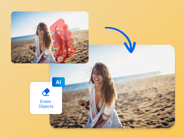
Small business owners are busy. We get it. It’s easy to take a photo, post it, and just ignore the background. But the thing is, that’s confusing to your audience. They may focus on the person in the foreground instead of your purse. They may focus on the seagull in the background instead of your swimsuit model. They may even focus on the layout of your website or any issues they face with it.

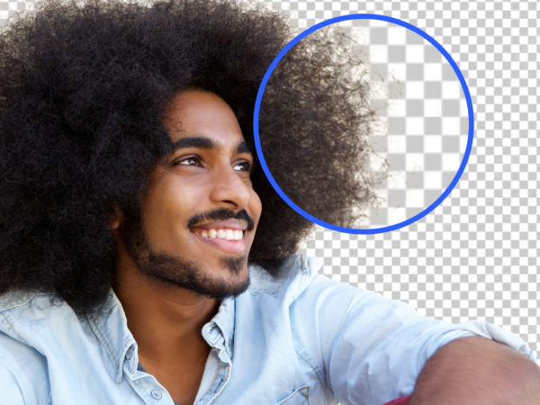
Does that mean your photo shoot is out? Of course not! Most modern photo software gives you cropping and object deletion options. We’re partial to our new intelligent update. Photo Studio now auto-detects background items ready for a one-click deletion. Poof, your product is no longer being photobombed by a cute dog. It’s cute but distracting.

What about my website? While small business owners can get busy, it’s easy to forget to keep up to date with their website. To resolve this, we recommend Codeable, who you can entrust with your website. You can hire one of their vetted WordPress developers to take care of your website, along with 24/7 customer support and a 28-day warranty. Away with your worries, we’ve got you covered!


Photo Tip 5 – Post Consistent to Your Brand, Consistently

Consistent posting allows your audience to grow. They’ll recognize your brand in their feed and stop to like and (even better) comment on your post. This is so important for budding small businesses.

“…if you upload posts at the same time every day, people will start to notice the pattern and check in with you instead of waiting for your posts to appear on their social media wall.” Chris Christoff, MonsterInsights

More important than posting on a regular schedule, which is crucial, is to post consistent-looking images. Meaning, if your photos are all dominated by white in the background, then keep doing that. If your Instagram images all have pink text, then keep doing that (see tip 3). If they’re black and white, keep at it. If the images are photos turned into line art, then do that. Whatever style you start with, keep at it.


Bonus: Photo Tip 6 – Try Photo Studio Today

We’d be remiss in not mentioning our software as a photo tip for small business owners. The price point is achievable and no graphic design skills are needed. So, why not try the background remover and other amazing tools in Photo Studio yourself? Can’t decide? Sign up for our free trial. You’ll have five days to access all the features free of charge. That’s hard to pass up!


Don’t be Afraid to Try New Things Out

If you want to take great photos, you should not only know how to react and when, but also where you can use the appropriate settings and filters. Get to know your phone or camera and understand how it works. You’ll have more fun, and your photos will be better too!

Experiment, move around, and get creative. Your fans and followers – and your sales figures – will thank you.

close